


When To Change Your Logo!
 John Fahy
If you are a start-up enterprise how much time and money should you invest in developing a corporate logo? If you already have a well-established logo should you devote some time to refreshing it or making it more contemporary? Let’s begin answering those questions by testing how aware you are of some major logo changes that have taken place in the past year. For example, did you spot Microsoft’s change of logo from,

to this,

The new logo was launched in August 2012 to coincide with the introduction of new products such as Windows 8 and the Surface tablet. The four coloured squares are intended to symbolise the company’s broad portfolio of products. Did you get that the first time you saw it? The change proved controversial - some saw the new logo as better and friendlier, others as boring or a missed opportunity. What we don’t know is how many people did not notice the change at all!
Of course some are much more subtle. I wonder how many fans of Twitter noticed this slight change made to Larry in June last year?
![]()
Old logo
![]()
New logo
Yes you weren’t the only one to miss that one. Or how about this one for Jaguar.
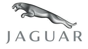
Old logo
![]()
New logo
This was touted as the most extensive change made to Jaguar’ visual identification in 40 years. Really? I suspect the majority of car owners missed it completely.
Some people get incredibly exercised about both about logo design and logo changes. Yet few things are more cringe worthy that listening to executives going on about how a logo change symbolises a brand’s brave move into new frontiers and markets. Any decision to change a logo should be carefully evaluated to see if there are substantive reasons for doing so. Too often it is a bad substitute for effective brand management as illustrated by farcical changes such as Gap’s new logo in 2011 which ultimately led to the departure of the executive responsible for the mess.
So if you are a start-up, it is worth putting some time into careful development of the logo. Try to make sure it is simple, different, visual and globally transferable. Nike, Apple, Facebook, Shell and Playboy are the templates. After that, keep the changes to a minimum. The quality of your brand management will have a much bigger impact on the global recognition of your logo than any aesthetic changes that might be deemed necessary from time to time.